


-
 Sivaprakash BKR
- PowerBuilder
- Monday, 5 October 2026 08:13 AM UTC
Hello,
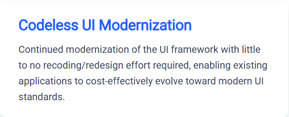
I see the above message under Looking Ahead: Next Major Release Roadmap. Would like to make a few suggestions that I prefer to have natively in Powerbuilder. May be there a workaround for one / all of these, but in-built native controls might be better.
1. Modern Controls
a. Card & Tile Layout Containers : Dashboard are inevitable in any applications now and Card & Tile layout plays an important role. A native CardView container with corner radius, elevation/shadows, and responsive wrap would instantly modernize dashboard views.
b. Vector Icon Support (SVG / Icon Fonts): I saw it somewhere that it's coming or already available. If not already available, it would be better to have it.
c. Modern Navigation Rails & Side Drawers: PowerBuilder needs a first-class NavigationRail control. Already industry moved from Ribbonbar to Side drawers, we also need to move on.
d. Segmented Button Bars & Toggle Switches: Traditional checkboxes and radio buttons look dated. Native modern toggle switches (iOS/Material style) and grouped segmented buttons (pill-shaped tab selectors) make filters and settings windows feel contemporary.
e. Floating "Toast" Notifications & In-App Banners: Modal MessageBox() popups interrupt workflow and scream Windows 95. A native non-blocking toast/snack-bar manager that slides in from the top or corner and self-dismisses is essential for modern UX.
The below are some points suggested by Google Gemini to modernize datawindows.
2. Upgrades the DataWindow Urgently Needs
The DataWindow is PB's greatest asset, but visually it feels like a 1990s spreadsheet unless heavily customized:
a. Fluid Responsive Resizing: Built-in auto-fit column modes (like flex: 1 or percentage-based width distributions) so columns scale gracefully when a window is resized, avoiding horizontal scrollbars on wide screens.
b. Clean Default Typography & Spacing: Generous default row padding (at least 32–40px row height instead of tightly packed 18px grids), borderless modern separators, and modern sans-serif defaults (Segoe UI, Aptos, or Inter).
c. Native Inline Badges & Status Indicators: Simple properties to render values as colored pill badges (e.g., green for Active, amber for Pending, red for Failed) without relying on computed bitmap tricks.
d. Interactive Row Actions on Hover: Showing contextual buttons (Edit, Delete, Copy) only when hovering over a specific row, keeping the grid clean and uncluttered.
Let's all come out with suggestions to Appeon to look into UI too the way the developers need it.
Happiness Always
BKR Sivaprakash
Find Questions by Tag
Helpful?
If a reply or comment is helpful for you, please don’t hesitate to click the Helpful button. This action is further confirmation of their invaluable contribution to the Appeon Community.