
With the upcoming release of PowerBuilder 2019, Appeon has added a new feature called “UI themes”, which enables you to control, through a style sheet, how the various visual objects and controls of PowerBuilder render. Of course, the style sheet covers the basics of changing the appearance, for example through fonts, colors, and border styles. But you can also change the user experience (UX) of interacting with visual controls by adjusting properties of various states, for example hover, pressed, focused, disabled, and so on. Let’s take a deeper look at this new feature.
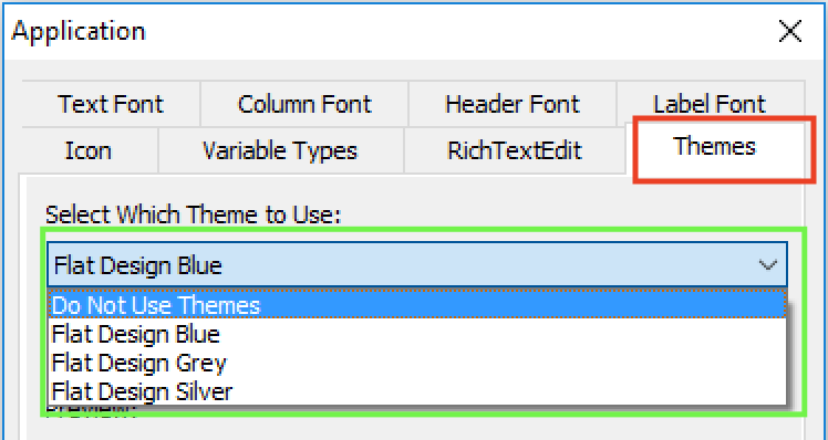
There is a new “Themes” tab added to the application object’s additional properties that allows you to specify whether to use this new feature, and if yes, what theme to use. Several pre-built themes are provided, but you can customize these themes or create your own. For details on how to do this please refer to the UI themes tutorial.
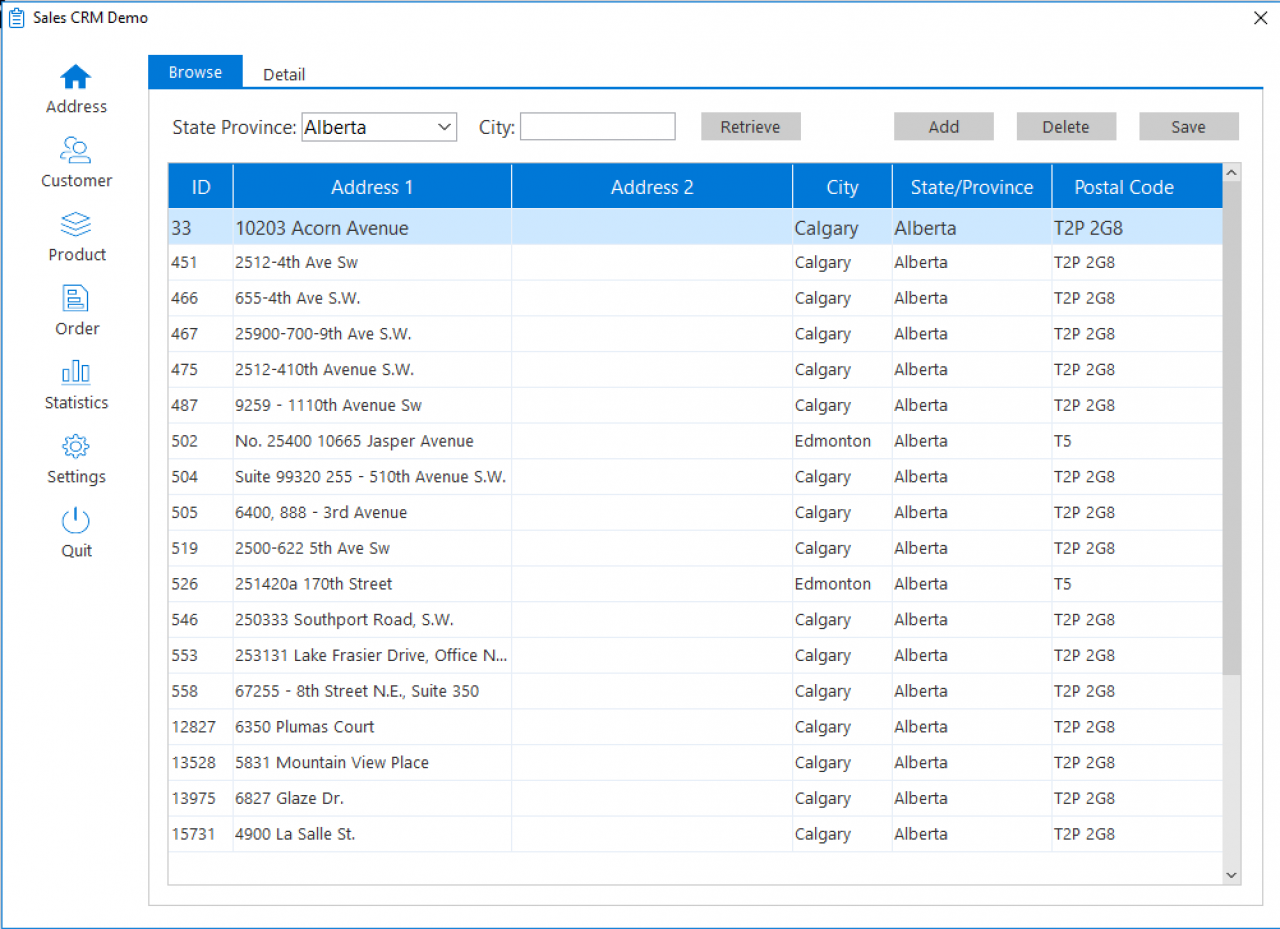
Below is an example of a PowerBuilder app with the “Flat Design Blue” theme applied. Besides the obvious difference in appearance compared to the Windows ’95 look that is common of many older PowerBuilder projects, this theme automatically enlarges the selected row in a DataWindow so it is easier to read. This is just one example of creating a better UX (arguably).
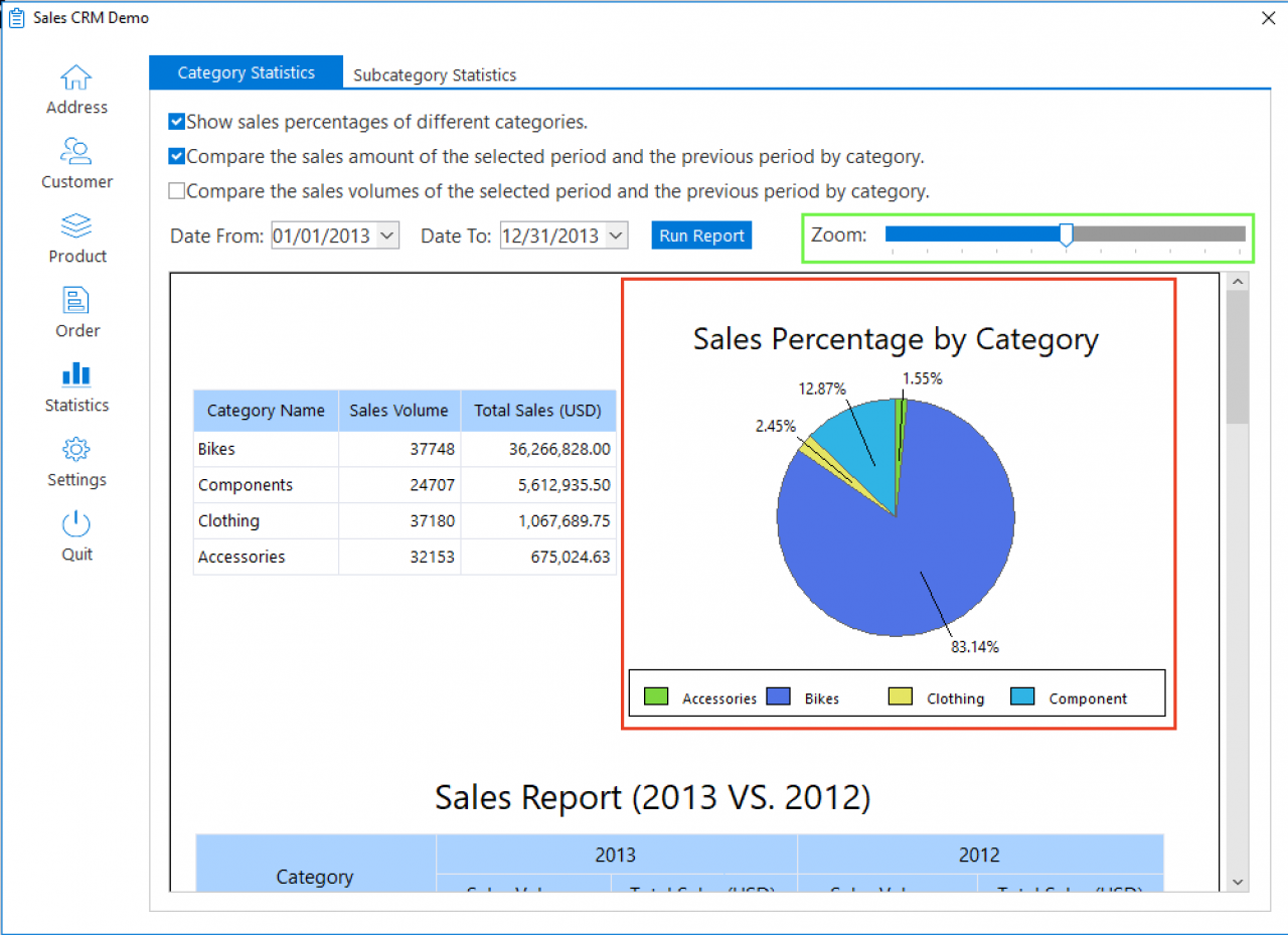
Of course, you could certainly manipulate the properties of PowerBuilder’s visual objects programmatically (using PowerScript). However, this would be more labor intensive to implement and costlier to maintain in the long run than using a style sheet to manage all these. Furthermore, you would not be able to achieve the same UI & UX as shown because the new UI theme feature allows you to control more properties of the visuals than through PowerScript manipulation. For example, you can control the color and style of the lines that divide columns in the DataWindows or sections of a graph. As another example, the TrackBar control, by adjusting several different properties, gets a major makeover. These examples mentioned are illustrated below.
UI themes are fully customizable and of course, you can create your own. To customize one of the pre-built themes you simply edit the theme’s style sheet Themes.json (in JSON format), which is located under C:\Program Files (x86)\Appeon\Shared\PowerBuilder\theme180\%theme%. Editing the theme’s style sheet is quite straightforward and intuitive. Here is a short code snippet of the “Flat Design Blue” Themes.json file:
{
	"checkbox":
	{
		"drawing":true,
		"normal-state":
		{
			"text-font":{"color":"#3C465A"},
			"box-images":
			{
				"unchecked":{"file":"checkbox-box-normal-unchecked.bmp"},
				"checked":{"file":"checkbox-box-normal-checked.bmp"},
				"indeterminate":{"file":"checkbox-box-normal-indeterminate.bmp"}
			}
		},
		"hover-state":
		{
			"text-font":{"color":"#55637F"},
			"box-images":
			{
				"unchecked":{"file":"checkbox-box-hover-unchecked.bmp"},
				"checked":{"file":"checkbox-box-hover-checked.bmp"},
				"indeterminate":{"file":"checkbox-box-hover-indeterminate.bmp"}
			}
		},
		"pressed-state":
		{
			"text-font":{"color":"#3C465A"},
			}
		},
		"disabled-state":
		{
			"text-font":{"color":"#B8C2CC"},
			"box-images":
			{
				"unchecked":{"file":"checkbox-box-disabled-unchecked.bmp"},
				"checked":{"file":"checkbox-box-disabled-checked.bmp"},
				"indeterminate":{"file":"checkbox-box-disabled-indeterminate.bmp"}
			}
		}
	}
If you create several different themes and want to give your application users the ability to switch as they wish you can dynamically change your theme during runtime using the ApplyTheme() function:
// Local Variable used to store the name of the Theme
STRING  ls_theme

// Get the Theme from the apisetup.ini file
ls_theme = ProfileString("apisetup.ini", "Setup", "Theme", "Flat Design Blue")

// Check if a Theme will be used
IF ls_theme <> "Do Not Use Themes" THEN
   // Apply the Selected Theme
   ApplyTheme(ls_theme)
END IF
Often times the visual aspects of business apps is neglected, and we hope with this new UI themes feature it will make it less burdensome to make improvements in these regards. This new feature is available in ALL editions of PowerBuilder 2019, and if you are an existing PowerBuilder 2017 customer you can begin testing this feature now in the customer beta program.